Lesson 7 - Web UI
In this lesson, you will learn the following:
- Developing Web UI with Lit and Shoelace
- Implementing a canvas component
- Implementing a zoom toolbar component
Web UI with Lit and Shoelace
When choosing a component library, I didn't want it to be tied to a specific framework implementation, see Web Components are not Framework Components — and That’s Okay. Web components is a good choice, and Lit provides reactive state, scoped styles, and a declarative template system to make the development process easier. Shoelace is an UI library based on Lit, Web Awesome is the fancy pants new name for it. Using them, we can make our canvas components framework-agnostic by supporting React, Vue, and Angular at the same time. It's worth noting that the spectrum-web-components component library used by Photoshop Web is also based on Lit, see: Photoshop is now on the web!
Photoshop is part of Adobe’s broader Creative Cloud ecosystem. Using a standardized Web Components strategy built on Lit allows UI consistency across applications.
Since this tutorial static site is written using VitePress, Vue instructions is used in the example pages, but no Vue syntax will be used in the components.
Next, we'll take the simple functionality that we already have and wrap it into UI components.
Canvas component
A canvas component is declared using Lit, and to avoid potential naming conflicts, we use ic as the component prefix:
import { LitElement } from 'lit';

@customElement('ic-canvas')
export class InfiniteCanvas extends LitElement {}
We define renderer property with decorator, so that we can use it with such syntax: <ic-canvas renderer="webgl" />.
import { property } from 'lit/decorators.js';

export class InfiniteCanvas extends LitElement {
    @property()
    renderer = 'webgl';
}
We want the canvas to follow the page's width and height, and Shoelace provides an out-of-the-box Resize Observer that throws a custom event sl-resize when the element's width or height changes. We declare the HTML in the render lifecycle provided by Lit, and the actual HTMLCanvasElement can be quickly queried via query:
export class InfiniteCanvas extends LitElement {
    @query('canvas', true)
    $canvas: HTMLCanvasElement;

    render() {
        return html`
            <sl-resize-observer>
                <canvas></canvas>
            </sl-resize-observer>
        `;
    }
}
Listens for size changes during the connectedCallback lifecycle and unlistsens during the disconnectedCallback lifecycle:
export class InfiniteCanvas extends LitElement {
    connectedCallback() {
        this.addEventListener('sl-resize', this.resize);
    }
    disconnectedCallback() {
        this.removeEventListener('sl-resize', this.resize);
    }
}
Lifecycle for canvas initialization
The question of when to create the canvas has been bugging me for a while, trying to get <canvas> in the connectedCallback lifecycle would return undefined since the CustomElement had not been added to the document yet, so naturally I couldn't query it via the DOM API. In the end I found that firstUpdated was a good time to trigger the custom event ic-ready after creating the canvas and bring the canvas instance in the event object, and to trigger the custom event ic-frame on each tick:
export class InfiniteCanvas extends LitElement {
    async firstUpdated() {
        this.#canvas = await new Canvas({
            canvas: this.$canvas,
            renderer: this.renderer as 'webgl' | 'webgpu',
        }).initialized;

        this.dispatchEvent(
            new CustomEvent('ic-ready', { detail: this.#canvas }),
        );

        const animate = (time?: DOMHighResTimeStamp) => {
            this.dispatchEvent(new CustomEvent('ic-frame', { detail: time }));
            this.#canvas.render();
            this.#rafHandle = window.requestAnimationFrame(animate);
        };
        animate();
    }
}
Is there a better solution than this hack?
Use async task
For this kind of scenario where an asynchronous task is executed and then rendered, React provides <Suspense>:
<Suspense fallback={<Loading />}>
    <SomeComponent />
</Suspense>
Lit also provides similar Async Tasks so that we can display the loading and error states before the asynchronous task completes and when it errors out. When creating an asynchronous task with Task, you need to specify the parameters and include the created <canvas> as a return value, so that it can be retrieved and rendered in the complete hook of the render function.
private initCanvas = new Task(this, {
    task: async ([renderer]) => {
      return canvas.getDOM();
    },
    args: () => [this.renderer as 'webgl' | 'webgpu'] as const,
});

render() {
  return this.initCanvas.render({
    pending: () => html`<sl-spinner></sl-spinner>`,
    complete: ($canvas) => html`
      <sl-resize-observer>
        ${$canvas}
        <ic-zoom-toolbar-lesson7 zoom=${this.zoom}></ic-zoom-toolbar-lesson7>
      </sl-resize-observer>
    `,
    error: (e) => html`<sl-alert variant="danger" open>${e}</sl-alert>`,
  });
}
For example, in Safari, which does not support WebGPU, the following error message will be displayed:
WebGPU is not supported by the browser.
So our canvas component is written. the framework-agnostic nature of web components allows us to use them in a consistent way. Take Vue and React for example:
<template>
    <ic-canvas renderer="webgl"></ic-canvas>
</template><div>
<ic-canvas renderer="webgl"></ic-canvas>
</div>Get the canvas instance by listening to the ic-ready custom event when the canvas is loaded:
const $canvas = document.querySelector('ic-canvas');
$canvas.addEventListener('ic-ready', (e) => {
    const canvas = e.detail;
    // 创建场景图
    canvas.appendChild(circle);
});
Here we will implement the camera zoom component.
Zoom component
The following figure shows the zoom component of Miro:
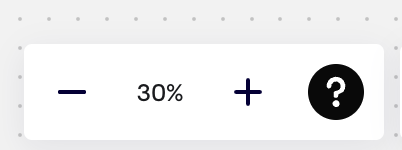
Let's create an ic-zoom-toolbar first:
@customElement('ic-zoom-toolbar')
export class ZoomToolbar extends LitElement {}
Add it to canvas component:
<sl-resize-observer>
    <canvas></canvas>
    <ic-zoom-toolbar zoom="${this.zoom}"></ic-zoom-toolbar> // [!code ++]
</sl-resize-observer>
The internal structure of this component looks like this, and you can see that Lit uses a template syntax that is very close to Vue:
<sl-button-group label="Zoom toolbar">
    <sl-tooltip content="Zoom out">
        <sl-icon-button
            name="dash-lg"
            label="Zoom out"
            @click="${this.zoomOut}"
        ></sl-icon-button>
    </sl-tooltip>
    <span>${this.zoom}%</span>
    <sl-tooltip content="Zoom in">
        <sl-icon-button
            name="plus-lg"
            label="Zoom in"
            @click="${this.zoomIn}"
        ></sl-icon-button>
    </sl-tooltip>
</sl-button-group>
In order to pass the canvas instance from the canvas component to its children, we use Lit Context, which is saved to the context after instantiation:
const canvasContext = createContext<Canvas>(Symbol('canvas'));

export class InfiniteCanvas extends LitElement {
    #provider = new ContextProvider(this, { context: canvasContext });

    private initCanvas = new Task(this, {
      task: async ([renderer]) => {
        // ...省略实例化画布过程
        this.#provider.setValue(this.#canvas);
      }
    });
}
It can then be consumed in the child component via the context, and since the canvas creation is asynchronous, it needs to be subscribe to allow us to keep track of the context in real time:
export class ZoomToolbar extends LitElement {
    @consume({ context: canvasContext, subscribe: true })
    canvas: Canvas;
}
Add a callback function to the camera that is triggered every time the camera or projection matrix changes:
export class Camera {
    onchange: () => void;
    private updateViewProjectionMatrix() {
        if (this.onchange) {
            this.onchange();
        }
    }
}
The responsive variable zoom is modified when the callback is triggered.
this.#canvas.camera.onchange = () => {
    this.zoom = Math.round(this.#canvas.camera.zoom * 100);
};
Theme
Theme needs to be applied to UI components and the canvas. Let's start with the former.
UI components
Shoelace provides Themes functionality, which can be easily switched. First, import the style sheets for the two themes:
import '@shoelace-style/shoelace/dist/themes/light.css';
import '@shoelace-style/shoelace/dist/themes/dark.css';
When switching to the dark theme, simply add an identifier class to the root element:
this.classList.toggle('sl-theme-dark', this.theme === 'dark');Finally, when writing component styles, use CSS variables instead of fixed values, so that they can be automatically applied when switching themes:
:host {
    background: var(--sl-panel-background-color);
}
In the follow-up Lesson 18 - Refactor with ECS, we replaced the Web Components implementation from Shoelace to Spectrum, which also provides a light/dark theme toggle feature:
Canvas background and grid
The background and Grid of the canvas also need to be associated with the theme color. Reference Theme colors in DGM.js, we support passing in the color values for the light and dark themes when creating the canvas:
enum Theme {
    LIGHT,
    DARK,
}

interface ThemeColors {
    background: string;
    grid: string;
}

interface CanvasConfig {
    themeColors?: Partial<{
        [Theme.LIGHT]: Partial<ThemeColors>;
        [Theme.DARK]: Partial<ThemeColors>;
    }>;
}
Support switching at runtime:
canvas.theme = Theme.DARK;We won't go into the details of the UI implementation later.
Internationalization
Lit provides Localization solution, it can be automated with the right tools.
Build localized template
First, you need to wrap strings requiring internationalization using the msg method. Taking the main menu as an example:
import { msg, str } from '@lit/localize';

<sp-tooltip slot="tooltip" self-managed placement="bottom">
    ${msg(str`Main menu`)}
</sp-tooltip>;
Then execute the following command to extract the language strings used from the source code:
lit-localize extractAt this point, you will obtain a series of xlf files. Send these xlf files to a translation service (or translate them manually, of course), and you will receive results similar to the following:
<?xml version="1.0" encoding="UTF-8"?>
<xliff version="1.2" xmlns="urn:oasis:names:tc:xliff:document:1.2">
<file target-language="zh-Hans" source-language="en" original="lit-localize-inputs" datatype="plaintext">
<body>
<trans-unit id="sa10f310edb35fa9f">
  <source>Main menu</source>
  <target>主菜单</target>
</trans-unit>
</body>
</file>
</xliff>
Then execute the following command to compile the translated strings into components and place them in the source code folder:
lit-localize buildSwitch locale
This website is built using VitePress. You can find a language switch component in the top-right corner.
import { localized } from '@lit/localize';

@customElement('ic-spectrum-top-navbar')
@localized()
export class TopNavbar extends LitElement {}
Can be loaded on demand at runtime:
import { configureLocalization } from '@lit/localize';
// Generated via output.localeCodesModule
import { sourceLocale, targetLocales } from './generated/locale-codes.js';

export const { getLocale, setLocale } = configureLocalization({
    sourceLocale,
    targetLocales,
    loadLocale: (locale) => import(`/locales/${locale}.js`),
});
For demonstration purposes, we've opted to use static imports. Of course, this approach loads all language files, impacting the time to first content.
Composite with slot
In the subsequent Lesson 18 - Refactor with ECS, we implemented a toolbar on the left side of the canvas. If we want to add a new tool to the toolbar, we can easily achieve this using the <slot> element from Web Components.
In many extensible plugins (such as the Eraser plugin), we've implemented similar usage:
<ic-spectrum-canvas>
    <ic-spectrum-penbar-eraser slot="penbar-item"><ic-spectrum-penbar-eraser />
</ic-spectrum-canvas>
Reserve expandable positions within Lit components using <slot>:
export class Penbar extends LitElement {
    render() {
        return html`<sp-action-group class="penbar">
            <slot name="penbar-item"></slot>
        </sp-action-group>`;
    }
}
It is worth noting that when passing a <slot> through the component tree, a named slot must be used in the parent component.
<!-- ic-spectrum-canvas -->
<ic-spectrum-penbar>
    <slot name="penbar-item" slot="penbar-item"></slot>
</ic-spectrum-penbar>